We use cookies and other tracking technologies to improve your browsing experience on our website, to show you personalized content and targeted ads, to analyze our website traffic, and to understand where our visitors are coming from.
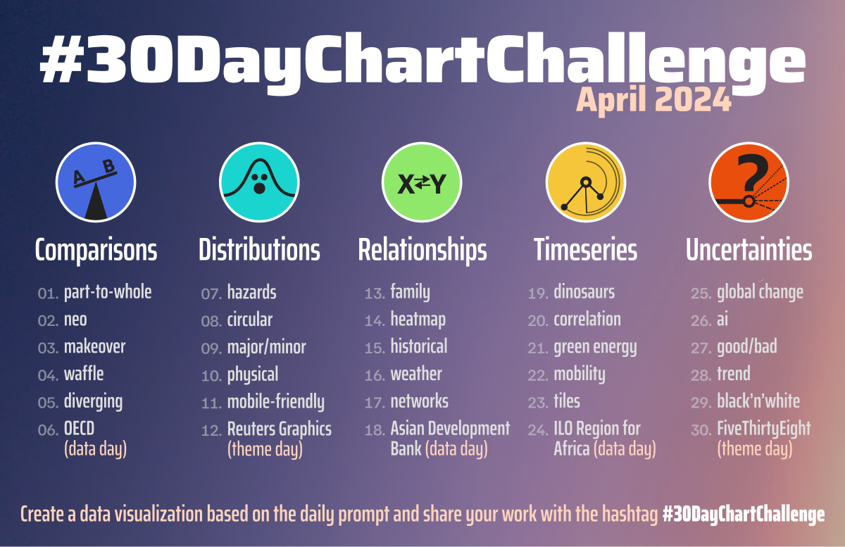
If you regularly scroll through dataviz social media you probably see lots of posts in April where people show off their work for the 30 Day Chart Challenge. I never participate in these chart or map challenges because usually they take me by surprise and it’s already a week in before I notice and then I figure I’m too late.
Well not this year. Even though I’m (checks calendar) three weeks late to the party, I’m going to try and add a few charts to the challenge. I figure it’s a good way to keep me consistently creating new visualisations, using the prompts to spur me to think about different data sources and dataviz approaches. My plan is to:
Produce charts for as many prompts as possible, working in prompt-day order.
Add them to this post, meaning the posting date will refresh to the date I’ve added the chart.So If I get to alot or even all of them, this will be a long post.
Use the table of contents to the right to navigate to a specific chart.
I may not get to every prompt, but I’ll do what I can. So let’s get going.
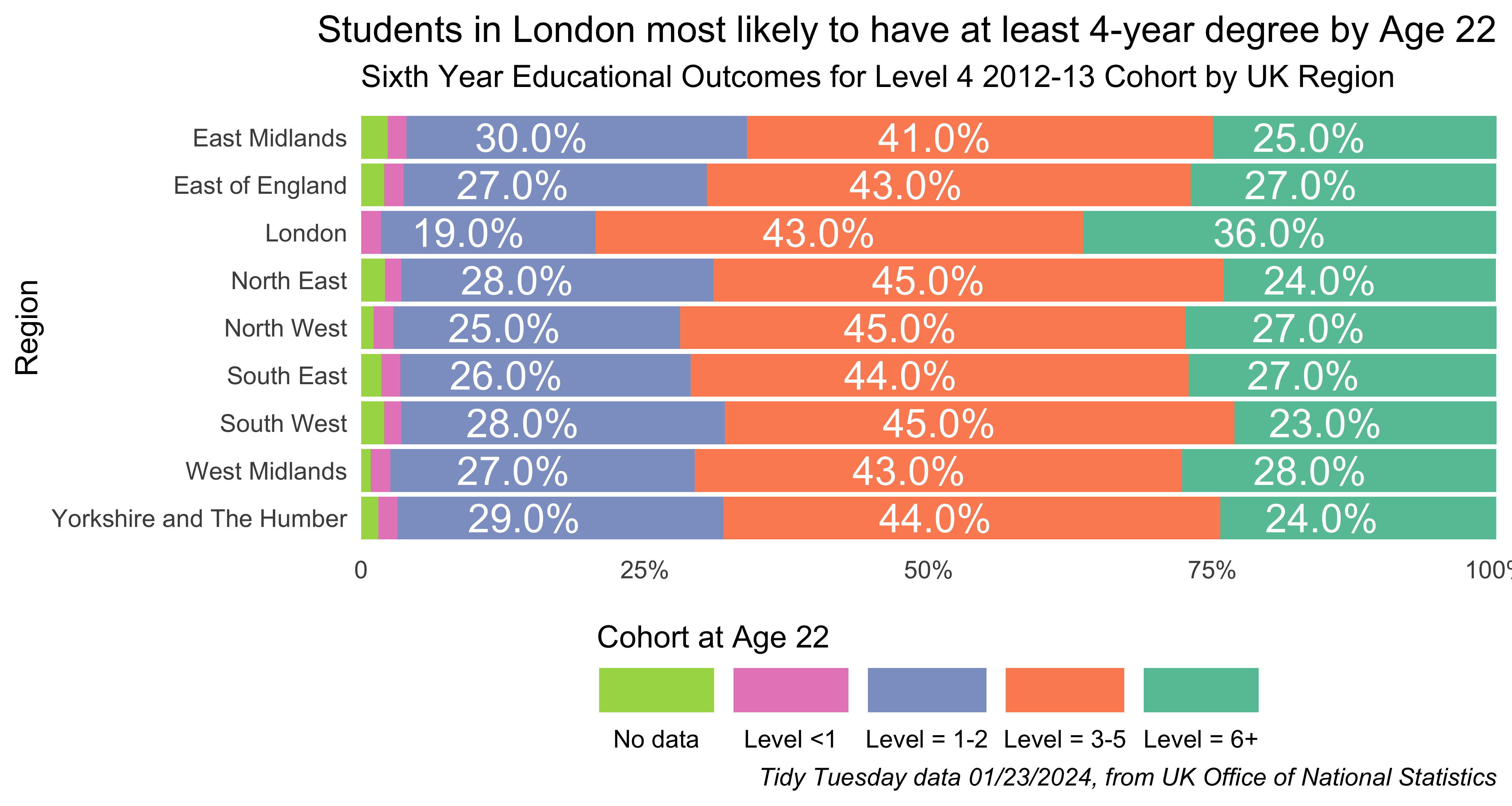
Prompt #1 - Part-to-Whole
I chose to interpret this prompt by doing a stacked bar chart displaying educational attainment as a proportion of populations by regions in the UK. It doubles as a late-to-the-party entry for the January 23, 2024 Tidy Tuesday challenge.
My plan for this was to knock out the chart in about an hour, but I needed up having to do a bit more data transformation than I thought. I also had to read up a bit on UK education levels and stages. In the end, it took a few hours to get it as I wanted.
First we’ll get and clean the data…
Show code for getting and cleaning data
library(tidyverse) # to do tidyverse thingslibrary(tidytuesdayR) #to get data from tidy tuesday repolibrary(tidylog) # to get a log of what's happening to the datalibrary(janitor) # tools for data cleaninglibrary(ggtext) # to help make ggplot text look good# load tidy tuesday dataukeduc1 <-tt_load("2024-01-23")# create tibble from csv, clean data, add some fields for the chartukeduc <-as_tibble(ukeduc1$english_education) %>%mutate(town11nm =ifelse(town11nm =="Outer london BUAs", "Outer London BUAs", town11nm)) %>%mutate(ttwa_classification =ifelse( town11nm %in%c("Inner London BUAs", "Outer London BUAs"), "Majority conurbation", ttwa_classification)) %>%mutate(ttwa11nm =ifelse( town11nm %in%c("Inner London BUAs", "Outer London BUAs"), "London", ttwa11nm)) %>%mutate(ttwa11cd =ifelse( town11nm %in%c("Inner London BUAs", "Outer London BUAs"), "E30000234", ttwa11cd)) %>%mutate(across(26:29, ~ifelse(is.na(.),0,.))) %>%mutate(level_sum =rowSums(.[c(26:29)])) %>%# to get the number of students in the achievement groups we need to multiply the cohort# by the percentage and divide by 100 as in the original data they were displayed as # full numbers, eg 17.2 instead of 0.172.mutate(highest_level_qualification_achieved_by_age_22_na =100- level_sum) %>%mutate(n_lesslev1_age22 =round(highest_level_qualification_achieved_by_age_22_less_than_level_1 * (ks4_2012_2013_counts/100) ,0)) %>%mutate(n_lev1to2_age22 =round(highest_level_qualification_achieved_by_age_22_level_1_to_level_2 * (ks4_2012_2013_counts/100) ,0)) %>%mutate(n_lev3to5_age22 =round(highest_level_qualification_achieved_by_age_22_level_3_to_level_5 * (ks4_2012_2013_counts/100) ,0)) %>%mutate(n_lev6plus_age22 =round(highest_level_qualification_achieved_by_age_22_level_6_or_above * (ks4_2012_2013_counts/100) ,0)) %>%mutate(n_lev_na_age22 =round(highest_level_qualification_achieved_by_age_22_na * (ks4_2012_2013_counts/100) ,0))
Ok, so we have data, let’s make the chart. It’s a horizontal bar chart showing the eudcational attainment at age 22 of a cohort of 15-16 year old students who sat for college qualifying exams (GCSEs) in the 2012-13 school year. Meaning the ending time point here is 2018-19. Attainment is plotted by level and by region. Because the original data is by town, we have to group by region to get what we want.
Show code for making the chart
# need to create cohort population by regionukeduc %>%rename(region =rgn11nm ) %>%# group by regions and create region totals group_by(region) %>%summarise(region_cohort =sum(ks4_2012_2013_counts),region_levless1_age22 =sum(n_lesslev1_age22),region_lev1to2_age22 =sum(n_lev1to2_age22),region_lev3to5_age22 =sum(n_lev3to5_age22),region_lev6plus_age22 =sum(n_lev6plus_age22),region_lev_na_age22 =sum(n_lev_na_age22)) %>%# pivot longer and make the education attainment field into factors. # factor labels for the chartpivot_longer(cols =ends_with("age22"), names_to ="ed_ettain_age22", values_to ="ed_attain_n") %>%mutate(ed_ettain_age22 =factor(ed_ettain_age22, levels =c("region_lev_na_age22", "region_levless1_age22", "region_lev1to2_age22", "region_lev3to5_age22", "region_lev6plus_age22"), labels =c("No data", "Level <1", "Level = 1-2", "Level = 3-5", "Level = 6+"))) %>%mutate(ed_attain_pct = ed_attain_n / region_cohort) %>%mutate(ed_attain_pct2 =round(ed_attain_pct*100, 1)) %>%ungroup() %>%mutate(region =factor(region)) %>%filter(!is.na(region)) %>%# pass this temporary set thru to the ggplot call {. ->> tmp} %>%ggplot(aes(ed_attain_pct, fct_rev(region), fill =fct_rev(ed_ettain_age22))) +geom_bar(stat ="identity") +scale_x_continuous(expand =c(0,0), breaks =c(0, 0.25, 0.50, 0.75, 1), labels =c("0", "25%", "50%", "75%", "100%")) +geom_text(data =subset(tmp, ed_attain_pct >0.025),aes(label = scales::percent(round(ed_attain_pct , 2))),position =position_stack(vjust =0.5),color="white", vjust =0.5, size =5) +labs(title ="Students in London most likely to have at least 4-year degree by Age 22",subtitle ="Sixth Year Educational Outcomes for Level 4 2012-13 Cohort by UK Region",caption ="*Tidy Tuesday data 01/23/2024, from UK Office of National Statistics*",x ="", y ="Region") +scale_fill_brewer(palette ="Set2") +theme_minimal() +theme(legend.position ="bottom", legend.spacing.x =unit(0, 'cm'), legend.key.width =unit(1.5, 'cm'), legend.margin=margin(-10, 0, 0, 0),plot.title =element_text(hjust =1), plot.caption =element_markdown(),panel.grid.major =element_blank(), panel.grid.minor =element_blank()) +guides(fill =guide_legend(label.position ="bottom", reverse =TRUE, title ="Cohort at Age 22", title.position ="top"))
We see from this chart that most in regions the rate of 4-year college degree completion (level 6+) was in the mid-high 20s, with students from the London region having the highest rate at 36%.
created and posted April 21, 2024
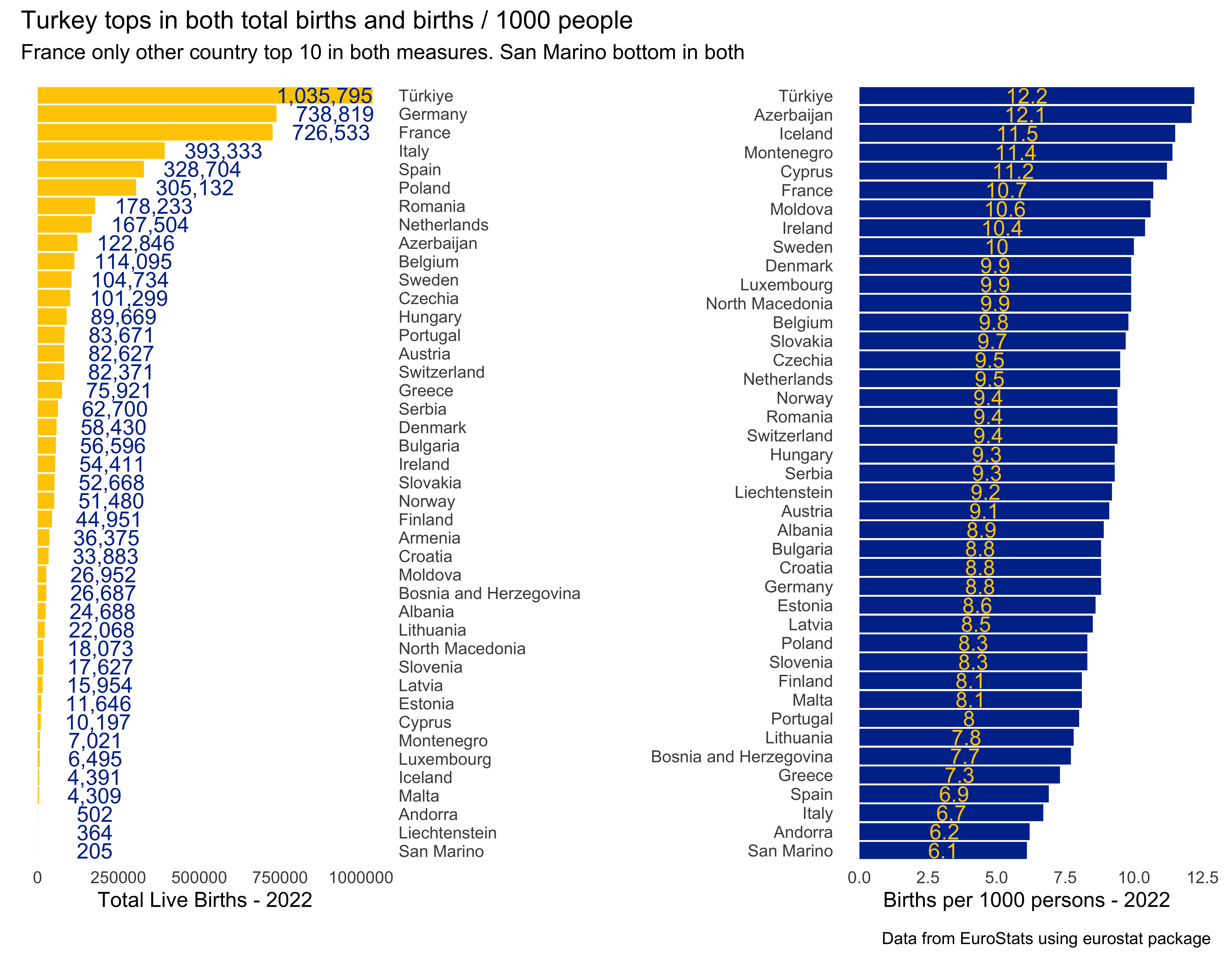
Prompt #2 - Neo
The way I chose to interpret “neo” was by using births by country, or new people by country. The data come from EuroStat, via the eurostat package. I’ll use total live births and births per 1000 people for the year 2022 (most recent year available). I’ll use patchwork to combine the plots. Unlike prompt 1, this only took a little more than an hour to do.
Getting the data is super simple, and it doesn’t need much cleaning, so I’ll do all the code in one chunk.
Show code for getting data and making the plots
# to know the table code "tps00204", I had to look up the dataset on-line and copy that value.# there is a function in the package to list all available data.births <- eurostat::get_eurostat("tps00204", type ="label", time_format ="num") %>%select(-freq) %>%rename(year = TIME_PERIOD)#> indexed 0B in0s, 0B/sindexed 1.00TB in0s, 1.18PB/s# make the plotstotal_births <-births %>%filter(year ==2022) %>%filter(indic_de =="Live births - number") %>%filter(!grepl("Euro",geo)) %>%arrange(desc(values), geo) %>%mutate(geo = forcats::fct_inorder(geo)) %>% {. ->> tmp} %>%ggplot(aes(values, fct_rev(geo))) +geom_bar(stat ="identity", fill ="#FFCC00") +scale_y_discrete(position ="right") +# need to subset data to get highest label to align similar to the restgeom_text(data =subset(tmp, values <800000),aes(label =format(values, big.mark=",")),color="#003399", size =4,hjust =-.25, nudge_x = .25) +geom_text(data =subset(tmp, values >800000),aes(label =format(values, big.mark =",")),color="#003399", size =4,hjust =1, nudge_x = .5) +labs(y ="", x ="Total Live Births - 2022") +theme_minimal() +theme(panel.grid.major =element_blank(), panel.grid.minor =element_blank())births_per1k <-births %>%filter(year ==2022) %>%filter(indic_de =="Crude birth rate - per thousand persons") %>%filter(!grepl("Euro",geo)) %>%arrange(desc(values), geo) %>%mutate(geo = forcats::fct_inorder(geo)) %>%ggplot(aes(values, fct_rev(geo))) +geom_bar(stat ="identity", fill ="#003399") +geom_text(aes(label = values),position =position_stack(vjust =0.5),color="#FFCC00", vjust =0.5, size =4) +labs(y ="", x ="Births per 1000 persons - 2022") +theme_minimal() +theme(panel.grid.major =element_blank(), panel.grid.minor =element_blank())# put them together with patchworklibrary(patchwork)total_births + births_per1k +plot_annotation(title ='Turkey tops in both total births and births / 1000 people',subtitle ='France only other country top 10 in both measures. San Marino bottom in both',caption ='Data from EuroStats using eurostat package')
There you have it. Turkey is tops in both total number of births and births per 1000 people. France is the only other country in the top 10. Interestingly, Spain is near the top in total number (it’s a big country) but towards the bottom in births per 1000. San Marino is last in both total births and rate.
What other interesting insights do you see here?
created and posted April 22, 2024
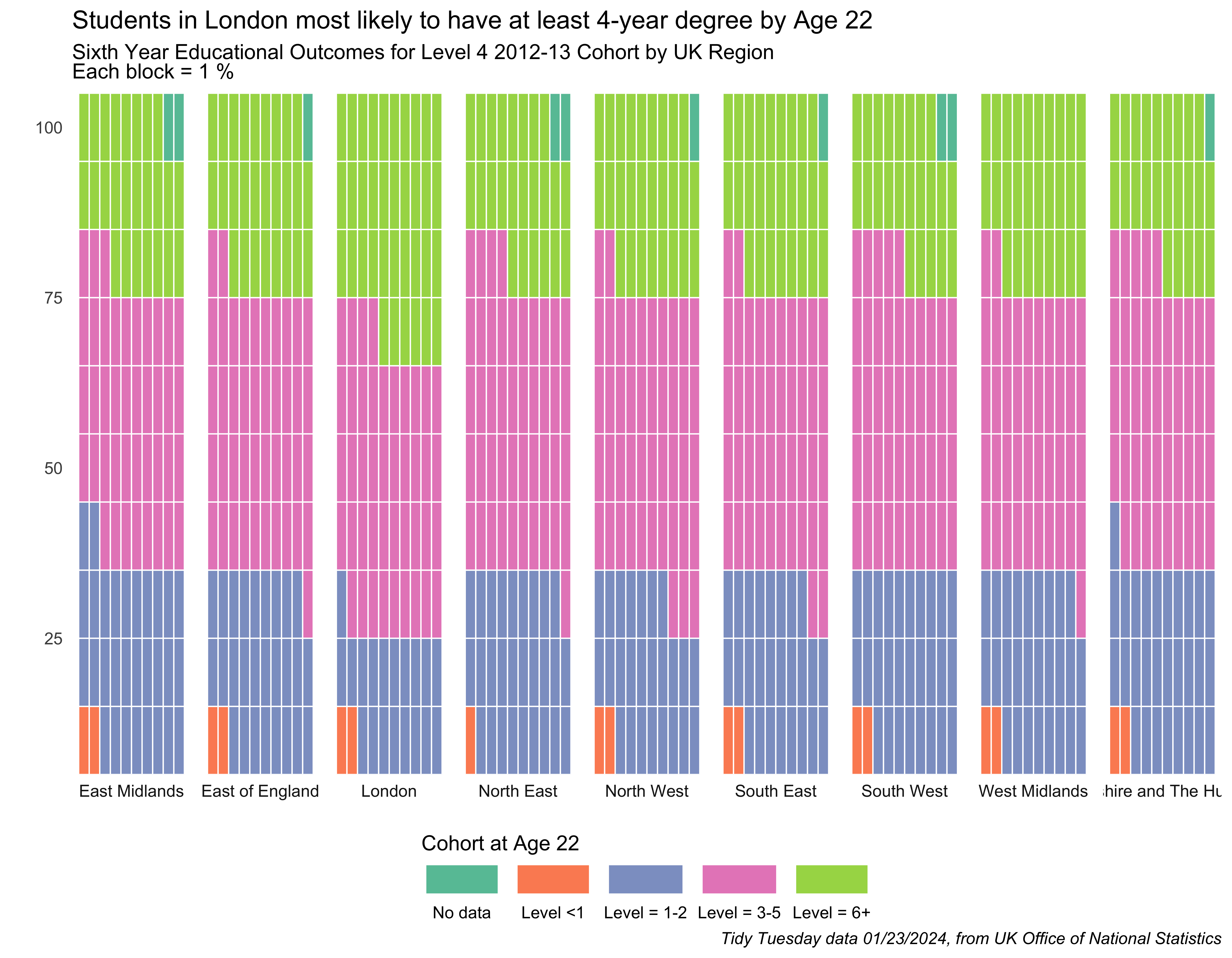
Prompts #3 & 4 - Redo & Waffle
For this prompt I fulfilled prompt 3 “redo” by redoing the chart for prompt 1, and made it a waffle chart to fulfill prompt 4. I’d never done a waffle chart before, so new chart type…hooray! Cheers to Yann Holtz for his code-through on his “R Graph Gallery” website to help me better understand how to set-up the data and plot it.
I’m once again using educational attainment data from the UK, via a Tidy Tuesday set from January 2024. We’ll get the data and make the chart in the same code chunk.
Show code for getting data and making the plots
library(tidyverse) # to do tidyverse thingslibrary(tidylog) # to get a log of what's happening to the datalibrary(janitor) # tools for data cleaninglibrary(tidytuesdayR) #to get data from tidy tuesday repo# some custom functionssource("~/Data/r/basic functions.R")## ggplot helpers - load if necessarylibrary(waffle) # ggplot helper to make a waffle chartlibrary(ggtext) # helper functions for ggplot text# load tidy tuesday dataukeduc1 <-tt_load("2024-01-23")# get variable namesukeduc_names <-as_tibble(names(ukeduc1$english_education))# create tibble from csv, clean dataukeduc <-as_tibble(ukeduc1$english_education) %>%mutate(town11nm =ifelse(town11nm =="Outer london BUAs", "Outer London BUAs", town11nm)) %>%mutate(ttwa_classification =ifelse(town11nm %in%c("Inner London BUAs", "Outer London BUAs"),"Majority conurbation", ttwa_classification)) %>%mutate(ttwa11nm =ifelse(town11nm %in%c("Inner London BUAs", "Outer London BUAs"),"London", ttwa11nm)) %>%mutate(ttwa11cd =ifelse(town11nm %in%c("Inner London BUAs", "Outer London BUAs"),"E30000234", ttwa11cd)) %>%mutate(across(26:29, ~ifelse(is.na(.),0,.))) %>%mutate(level_sum =rowSums(.[c(26:29)])) %>%mutate(highest_level_qualification_achieved_by_age_22_na =100- level_sum) %>%mutate(n_lesslev1_age22 =round(highest_level_qualification_achieved_by_age_22_less_than_level_1 * (ks4_2012_2013_counts/100) ,0)) %>%mutate(n_lev1to2_age22 =round(highest_level_qualification_achieved_by_age_22_level_1_to_level_2 * (ks4_2012_2013_counts/100) ,0)) %>%mutate(n_lev3to5_age22 =round(highest_level_qualification_achieved_by_age_22_level_3_to_level_5 * (ks4_2012_2013_counts/100) ,0)) %>%mutate(n_lev6plus_age22 =round(highest_level_qualification_achieved_by_age_22_level_6_or_above * (ks4_2012_2013_counts/100) ,0)) %>%mutate(n_lev_na_age22 =round(highest_level_qualification_achieved_by_age_22_na * (ks4_2012_2013_counts/100) ,0))glimpse(ukeduc)#> Rows: 1,104#> Columns: 38#> $ town11cd <chr> "E34…#> $ town11nm <chr> "Car…#> $ population_2011 <dbl> 5456…#> $ size_flag <chr> "Sma…#> $ rgn11nm <chr> "Eas…#> $ coastal <chr> "Non…#> $ coastal_detailed <chr> "Sma…#> $ ttwa11cd <chr> "E30…#> $ ttwa11nm <chr> "Wor…#> $ ttwa_classification <chr> "Maj…#> $ job_density_flag <chr> "Res…#> $ income_flag <chr> "Hig…#> $ university_flag <chr> "No …#> $ level4qual_residents35_64_2011 <chr> "Low…#> $ ks4_2012_2013_counts <dbl> 65, …#> $ key_stage_2_attainment_school_year_2007_to_2008 <dbl> 65.0…#> $ key_stage_4_attainment_school_year_2012_to_2013 <dbl> 70.7…#> $ level_2_at_age_18 <dbl> 72.3…#> $ level_3_at_age_18 <dbl> 50.7…#> $ activity_at_age_19_full_time_higher_education <dbl> 30.7…#> $ activity_at_age_19_sustained_further_education <dbl> 21.5…#> $ activity_at_age_19_appprenticeships <dbl> NA, …#> $ activity_at_age_19_employment_with_earnings_above_0 <dbl> 52.3…#> $ activity_at_age_19_employment_with_earnings_above_10_000 <dbl> 36.9…#> $ activity_at_age_19_out_of_work <dbl> NA, …#> $ highest_level_qualification_achieved_by_age_22_less_than_level_1 <dbl> 0.0,…#> $ highest_level_qualification_achieved_by_age_22_level_1_to_level_2 <dbl> 34.9…#> $ highest_level_qualification_achieved_by_age_22_level_3_to_level_5 <dbl> 39.7…#> $ highest_level_qualification_achieved_by_age_22_level_6_or_above <dbl> 0.0,…#> $ highest_level_qualification_achieved_b_age_22_average_score <dbl> 3.32…#> $ education_score <dbl> -0.5…#> $ level_sum <dbl> 74.6…#> $ highest_level_qualification_achieved_by_age_22_na <dbl> 25.4…#> $ n_lesslev1_age22 <dbl> 0, 0…#> $ n_lev1to2_age22 <dbl> 23, …#> $ n_lev3to5_age22 <dbl> 26, …#> $ n_lev6plus_age22 <dbl> 0, 8…#> $ n_lev_na_age22 <dbl> 17, …# cohort ed attainment by regionukeduc2 <- ukeduc %>%rename(region =rgn11nm ) %>%group_by(region) %>%summarise(region_cohort =sum(ks4_2012_2013_counts),region_levless1_age22 =sum(n_lesslev1_age22),region_lev1to2_age22 =sum(n_lev1to2_age22),region_lev3to5_age22 =sum(n_lev3to5_age22),region_lev6plus_age22 =sum(n_lev6plus_age22)) %>%pivot_longer(cols =ends_with("age22"), names_to ="ed_attain_age22", values_to ="ed_attain_n") %>%mutate(ed_attain_pct = ed_attain_n / region_cohort) %>%mutate(ed_attain_pct2 =round(ed_attain_pct*100)) %>%mutate(region =factor(region))%>%filter(!is.na(region)) %>%select(region, region_cohort, ed_attain_age22, ed_attain_pct2) %>%## the data was a bit messy, so to get the values to sum to 100 to make the waffle## chart fill the plot area, I had to do a little reshaping after doing the percentages.pivot_wider(names_from = ed_attain_age22, values_from = ed_attain_pct2) %>%mutate(region_sum =rowSums(.[c(3:6)])) %>%mutate(region_lev_na_age22 =ifelse(region_sum <100, 100- region_sum, 0)) %>%select(-region_sum) %>%pivot_longer(cols =ends_with("age22"), names_to ="ed_attain_age22", values_to ="ed_attain_pct") %>%mutate(ed_attain_age22 =factor(ed_attain_age22,levels =c("region_lev_na_age22", "region_levless1_age22", "region_lev1to2_age22","region_lev3to5_age22", "region_lev6plus_age22"),labels =c("No data", "Level <1", "Level = 1-2","Level = 3-5", "Level = 6+")))glimpse(ukeduc2)#> Rows: 45#> Columns: 4#> $ region <fct> East Midlands, East Midlands, East Midlands, East Midl…#> $ region_cohort <dbl> 39811, 39811, 39811, 39811, 39811, 48849, 48849, 48849…#> $ ed_attain_age22 <fct> Level <1, Level = 1-2, Level = 3-5, Level = 6+, No dat…#> $ ed_attain_pct <dbl> 2, 30, 41, 25, 2, 2, 27, 43, 27, 1, 2, 19, 43, 36, 0, …## chartukeduc2 %>%ggplot(aes(fill = ed_attain_age22, values = ed_attain_pct)) +geom_waffle(na.rm=TRUE, n_rows=10, flip=TRUE, size =0.33, colour ="white") +facet_wrap(~region, nrow=1,strip.position ="bottom") +scale_x_discrete() +scale_y_continuous(labels =function(x) x *10, # make this multiplyer the same as n_rowsexpand =c(0,0)) +scale_fill_brewer(palette ="Set2") +labs(title ="Students in London most likely to have at least 4-year degree by Age 22",subtitle ="Sixth Year Educational Outcomes for Level 4 2012-13 Cohort by UK Region<br> Each block = 1 %",caption ="*Tidy Tuesday data 01/23/2024, from UK Office of National Statistics*",x ="", y ="") +theme_minimal() +theme(legend.position ="bottom", legend.spacing.x =unit(0, 'cm'),legend.key.width =unit(1.5, 'cm'), legend.margin=margin(-10, 0, 0, 0),plot.title =element_text(hjust =0), plot.subtitle =element_markdown(),plot.caption =element_markdown(),panel.grid.major =element_blank(), panel.grid.minor =element_blank()) +guides(fill =guide_legend(label.position ="bottom", title ="Cohort at Age 22", title.position ="top"))
So alright, a waffle chart. Similar insights from the horizontal bar, just visualized a bit differently.
created and posted April 23, 2024
Prompt #5 - Diverging
Staying with the theme of educational attainment, but switching countries to Denmark (where I was born and now live again), let’s look at differences in educational attainment for people in Denmark aged 25-69. The data come from Danmarks Statistik (Statistics Danmark, the national statistics agency) via the danstat package. I’ve been wanting to use the package, this was a great excuse.
I won’t do too much explaining about education levels in Denmark, you can read up on them on the ministry’s page.
The danstat package is fairly easy to use once you get the hang of sorting out the table name and number, and variable names and values you need to filter on. It’s a good idea to start at Danmarks Statistik’s StatBank page, search the data you want, and when you find the table, you’ll see the code, in this case HFUDD11, and use that in the package calls. To see what I mean, let’s start with getting the data.
Show code for getting data
library(tidyverse) # to do tidyverse thingslibrary(tidylog) # to get a log of what's happening to the datalibrary(janitor) # tools for data cleaninglibrary(danstat) # package to get Danish statistics via apilibrary(ggtext) # enhancements for text in ggplot# some custom functionssource("~/Data/r/basic functions.R")# metadata for table variables, click thru nested tables to find variables and ids for filterstable_meta <- danstat::get_table_metadata(table_id ="hfudd11", variables_only =TRUE)# create variable list using the ID value in the variablevariables_ed <-list(list(code ="bopomr", values ="000"),list(code ="hfudd", values =c("H10", "H20", "H30", "H35","H40", "H50", "H60", "H70", "H80", "H90")),list(code ="køn", values =c("M","K")),list(code ="alder", values =c("25-29", "30-34", "35-39", "40-44", "45-49","50-54", "55-59", "60-64", "65-69")),list(code ="tid", values =2023))# past variable list along with table name. # note that in package, table name is lower case, though upper case on statbank page.edattain <-get_data("hfudd11", variables_ed, language ="da") %>%as_tibble() %>%select(sex = KØN, age = ALDER, edlevel = HFUDD, n = INDHOLD)
The data I pulled is by sex, age, and education level. I needed to age variable to filter for age 25+, as the set starts at age 15. At some point for another post I plan to look a bit more deeply at educational attainment here, including region and age and other fields. So let’s clean the data and get it ready to plot a diverging bar chart.
Even though I’ve calculated percentages for sex by age by education level, I won’t be doing any breakdowns by age here, again, that’s a later independent post. But at least I have the code now.
Show code for cleaning data
edattain1 <- edattain %>%## create factors from the education levelsmutate(edlevel =factor(edlevel,levels =c("H10 Grundskole", "H20 Gymnasiale uddannelser","H30 Erhvervsfaglige uddannelser", "H35 Adgangsgivende uddannelsesforløb","H40 Korte videregående uddannelser, KVU", "H50 Mellemlange videregående uddannelser, MVU","H60 Bacheloruddannelser, BACH", "H70 Lange videregående uddannelser, LVU","H80 Ph.d. og forskeruddannelser", "H90 Uoplyst mv."),labels =c("Grundskole/Primary", "Gymnasium","Erhvervsfaglige/Vocational HS", "Adgangsgivende/Qualifying","KVU/2-year college", "MVU/Professional BA","Bachelor", "LVU/Masters", "PhD", "Not stated" ))) %>%mutate(sex =ifelse(sex =="Kvinder", "Kvinder/Women", "Mænd/Men")) %>%# calculate total number by sexarrange(sex, edlevel) %>%group_by(sex) %>%mutate(tot_sex =sum(n)) %>%ungroup() %>%# calculate total number by sex and ed levelgroup_by(sex, edlevel) %>%mutate(tot_sex_edlev =sum(n)) %>%ungroup() %>%# calculate total number by sex and agegroup_by(sex, age) %>%mutate(tot_sex_age =sum(n)) %>%ungroup() %>%# calculate percentages mutate(level_pct =round(tot_sex_edlev / tot_sex, 3)) %>%mutate(level_pct =ifelse(sex =="Mænd/Men", level_pct *-1, level_pct)) %>%mutate(level_pct2 =round(level_pct *100, 1)) %>%mutate(age_level_pct =round(n / tot_sex_age, 3)) %>%mutate(age_level_pct =ifelse(sex =="Mænd/Men", age_level_pct *-1, age_level_pct)) %>%mutate(age_level_pct2 =round(age_level_pct *100, 1))
Now let’s make the plot.
Show code for making the plot
vlines_df <-data.frame(xintercept =seq(-100, 100, 20))edattain1 %>%filter(!edlevel =="Not stated") %>%distinct(sex, edlevel, .keep_all =TRUE) %>%select(sex, edlevel:tot_sex, level_pct, level_pct2 ) %>%# pass this temporary set thru to the ggplot call {. ->> tmp} %>%ggplot() +geom_col(aes(x =-50, y = edlevel), width =0.75, fill ="#e0e0e0") +geom_col(aes(x =50, y = edlevel), width =0.75, fill ="#e0e0e0") +geom_col(aes(x = level_pct2, y = edlevel, fill = sex, color = sex), width =0.75) +scale_x_continuous(labels =function(x) abs(x), breaks =seq(-100, 100, 20)) +geom_vline(data = vlines_df, aes(xintercept = xintercept), color ="#FFFFFF", size =0.1, alpha =0.5) +coord_cartesian(clip ="off") +scale_fill_manual(values =c("#C8102E", "#FFFFFF")) +scale_color_manual(values =c("#C8102E", "#C8102E")) +geom_text(data =subset(tmp, sex =="Mænd/Men"),aes(x = level_pct2, y = edlevel, label =paste0(abs(level_pct2), "%")),size =5, color ="#C8102E",hjust =1, nudge_x =-.5) +geom_text(data =subset(tmp, sex =="Kvinder/Women"),aes(x = level_pct2, y = edlevel, label =paste0(abs(level_pct2), "%")),size =5, color ="#C8102E",hjust =-.25) +labs(x ="", y ="",title ="In Denmark, <span style = 'color: #C8102E;'>women</span> more likely than men for highest education level to be <br>Professional BA (MVU) or Masters.<br><br>Men more likely to stop at primary level or vocational secondary diploma.",subtitle ="<br>*Highest level of education attained by all people in Denmark aged 25-69 as of Sept 30 2023. <br><span style = 'color: #C8102E;'>Women are red bars</span>, men are white.*",caption ="*Data from Danmarks Statistik via danstat package*") +theme_minimal() +theme(panel.grid =element_blank(), plot.title =element_markdown(),plot.subtitle =element_markdown(), plot.caption =element_markdown(),legend.position ="none",axis.text.y =element_text(size =10))
There it is, a simple, clean chart showing how highest educational attainment differs for women and men in Denmark. I’m definitely interested in exploring differences by age group and by region.
created and posted April 24, 2024
Prompt #6 - OECD
Staying with the emerging theme of educational attainment, this prompt was a good excuse to try out the oecd package. The package wraps functions to access OECD data through their API for their Data Explorer platform.
It’s fairly straight forward to use…look up the table you want, set the filters, copy the API script and parse out as the package documentation shows. In the example they do not show it, but make sure if you set time parameters that you put it in the start_date and end_date calls. You can of course name the dataset and filters anything you want. I chose my names so they wouldn’t conflict with function calls.
For this chart I looked at educational attainment in Nordic countries; Denmark, Finland, Iceland, Norway, & Sweden (i), by sex for all people aged 25 to 64 in 2022. For the sake of expediency, I’ll copy the overall format & theme from prompt 1.
i) let’s not get into here the difference between Nordic & Scandinavian, what constitutes Scandinavian & why…
The code for getting the data and making the chart is below.
Show code for prompt 6
## code for 30 Day Chart Challenge 2024, day 6 OECD## educational attainment via OECD package## nordics, by sex 25 to 64, 2020-2022library(tidyverse) # to do tidyverse thingslibrary(tidylog) # to get a log of what's happening to the datalibrary(janitor) # tools for data cleaninglibrary(OECD) # package to get OECD data via apilibrary(ggtext) # enhancements for text in ggplot# table from website# https://www.oecd-ilibrary.org/education/data/education-at-a-glance/educational-attainment-and-labour-force-status_889e8641-enedattdata <-"OECD.CFE.EDS,DSD_REG_EDU@DF_ATTAIN,1.0"edattfilter <-"A.CTRY.SWE+NOR+ISL+FIN+DNK...Y25T64.F+M.ISCED11_0T2+ISCED11_5T8+ISCED11_3_4.."oecd1 <-get_dataset(edattdata, edattfilter, start_time =2020, end_time =2022)# get metadata - helpful to create labels for factors.# see package documentation on github # commented out here to speed up rendering of post html file...this takes a while to download# oecd_metadata <- get_data_structure(edattdata)# gets labels for country codes...this step commented out, data loading from local file.# datalabs_ct <- oecd_metadata$CL_REGIONAL %>%# rename(COUNTRY = id)datalabs_ct <-readRDS("~/Data/r/30 Day Chart Challenge/2024/data/oecd_datalabs_ct.rds") # keep only necessary vars, change some to factors & add labelsoecd <- oecd1 %>%mutate(EDUCATION_LEV =factor(EDUCATION_LEV,levels =c("ISCED11_0T2", "ISCED11_3_4", "ISCED11_5T8"),labels =c("Pre-primary thru lower secondary","Upper secondary and non-degree tertiary", "Tertiary education"))) %>%mutate(SEX =case_when(SEX =="M"~"Male", SEX =="F"~"Female")) %>%mutate(pct_attain2 =as.numeric(ObsValue)) %>%mutate(pct_attain = pct_attain2 /100) %>%# join to have labels instead of country abbrvsleft_join(datalabs_ct) %>%select(country = label, year = TIME_PERIOD, SEX, EDUCATION_LEV, pct_attain, pct_attain2) %>%clean_names()## chart...horizontal stacked baroecd %>%filter(year =="2022") %>%ggplot(aes(pct_attain, fct_rev(country), fill =fct_rev(education_lev))) +geom_bar(stat ="identity") +scale_x_continuous(expand =c(0,0),breaks =c(.01, 0.25, 0.50, 0.75, .97),labels =c("0", "25%", "50%", "75%", "100%")) +facet_wrap(~ sex, nrow =1) +geom_text(aes(label = scales::percent(round(pct_attain , 2))),position =position_stack(vjust =0.5),color="white", vjust =0.5, size =5) +labs(title ="In Nordic countries, women age 25-64 more likely than men to complete college.<br><br> Finns have lowest levels of attainment stopping at lower secondary",subtitle ="<br>*Educational Attainment in Nordic Countries, by Sex, ages 25-64 combined, 2022*",caption ="*Data from OECD, via oecd package for r*",x ="", y ="") +scale_fill_brewer(palette ="Set2") +theme_minimal() +theme(legend.position ="bottom", legend.spacing.x =unit(0, 'cm'),legend.key.width =unit(1.5, 'cm'), legend.margin=margin(-10, 0, 0, 0),plot.title =element_markdown(), plot.subtitle =element_markdown(),plot.caption =element_markdown(),axis.text.y =element_text(size =12),panel.grid.major =element_blank(), panel.grid.minor =element_blank()) +guides(fill =guide_legend(label.position ="bottom", reverse =TRUE,title ="Education Levels", title.position ="top"))
You can see that there are some differences in levels of attainment between countries. I don’t know enough context to speculate as to why. Also, as you add more countries to the filter, the education levels and age groups are aggregated into bigger buckets, presumably to facilitate comparisons. Denmark has a good national database where you can drill down more by age and level, so if I wanted to look at differences by smaller age groups and over time, I’d have to dig into the individual countries national statistics databanks and would have to hope that the age groups and attainment levels are similar enough.
created and posted April 26, 2024
Prompt #7 - Hazards
Hazards is vague enough to mean anything, and if you search the socials for maps submitted for this prompt you’ll see a variety of approaches. Right away I thought of crime stats, and also right away I knew I wanted to make a map of crime data in Denmark.
So that’s what I set out to do.
But very soon into building it I realized I wanted to visualise different types of crime, which meant multiple plots. So then I got it in my head that this should be an exercise in really getting comfortable with functional programming and iterating using map() or a similar approach.
So that’s what I did.
Follow along now as we get data, build a plot function, map over it, and make some maps.
First, the data. As with the diverging challenge I got the data from Danmarks Statistik (Statistics Danmark, the national statistics agency). Unlike the diverging challenge, I did not end up using the danstat package.
Why? Well I wanted to use the province aggregation, the middle level between towns and regions. I wanted to see a bit of nuance in the maps. The problem is, while province data can be pulled from the StatBank data portal the API only has cities, regions, and all of Denmark. So loading flat-files it is.
But In this first chunk we get the geographic boundary data. For this we’ll be using NUTS3 level. What are the NUTS levels? (settle down, Beavis) Well, per the European Commission and Eurostat they are:
“The Nomenclature of territorial units for statistics, abbreviated NUTS (from the French version Nomenclature des Unités territoriales statistiques) is a geographical nomenclature subdividing the economic territory of the European Union (EU) into regions at three different levels (NUTS 1, 2 and 3 respectively, moving from larger to smaller territorial units).
In Denmark NUTS1 is the entire country, NUTS2 are the major regions, and NUTS3 are the provinces. The process for doing this comes from one of the excellent tutorials by Milos Popvic in his Milos Makes Maps series of video and code how-tos.
Show code for getting map boundary data
# load all the packages we'll needlibrary(tidyverse) # to do tidyverse thingslibrary(sf) # to make our geo data mappablelibrary(giscoR) # gets the region level boundrieslibrary(tidylog) # to get a log of what's happening to the datalibrary(janitor) # tools for data cleaninglibrary(danstat) # package to get Danish statistics via apilibrary(ggtext) # enhancements for text in ggplotlibrary(patchwork) # puts plots togethersource("~/Data/r/basic functions.R")### Get mapping data# define longlat projectioncrsLONGLAT <-"+proj=longlat +datum=WGS84 +no_defs +ellps=WGS84 +towgs84=0,0,0"# get NUTS3 data for Denmark and use sf to make it plottablenuts3_dk <- giscoR::gisco_get_nuts(year ="2021", resolution ="3",nuts_level ="3", country ="DK") |>rename(province_name = NAME_LATN) |> sf::st_transform(crsLONGLAT)
Now we add the crime and population data via spreadsheet import, and join it to the map data. The crime data needs a bit of tidying up, shortening the names, some other text edits. We’ll normalize crime data by incidents per 100,000 people. Because the crime data come by yearly quarters and I wanted one entire year (adding up the four quarters), I pulled population data for the start of the 3rd quarter of 2023. I figured that was a good representative time-point for the entire year.
Show code for getting crime and population data
crime_2023_1 <- readxl::read_excel("~/Data/r/30 Day Chart Challenge/2024/data/dk_crime_by_province_2023.xlsx") %>%clean_names() %>%fill(offence_cat_code) %>%fill(offence_cat_name) %>%rename_with(~sub("^x", "tot_", .x), starts_with(("x"))) %>%mutate(tot_2023 =rowSums(.[c(5:8)])) %>%mutate(province_name =str_replace(province_name, "Province ", "")) %>%mutate(offence_cat_name =str_replace(offence_cat_name, ", total", "")) %>%mutate(offence_cat_name =str_replace( offence_cat_name, "Nature of the offence", "All offences")) %>%mutate(offence_cat_name =str_replace( offence_cat_name, "Offences against property", "Property crime")) %>%mutate(offence_cat_name =str_replace( offence_cat_name, "Crimes of violence", "Violent crime")) %>%mutate(offence_cat_name =factor(offence_cat_name,levels =c("All offences", "Criminal code", "Sexual offenses", "Violent crime", "Property crime","Other offences", "Special acts"))) %>%select(province_name, offence_cat_name, tot_2023)## get population data to normalize # based on total at start of 2023 Q3pop_2023 <- readxl::read_excel("~/Data/r/30 Day Chart Challenge/2024/data/dk_pop_2023_q3.xlsx") %>%clean_names() %>%mutate(province_name =str_replace(province_name, "Province ", ""))# join crime & populationcrime_2023_2 <- crime_2023_1 %>%left_join(pop_2023) %>%mutate(crime_per1k =round(tot_2023 / tot_pop *100000, 0))## left_join nuts sf object to crime data to get sf object for plotcrime_2023 <- nuts3_dk %>%left_join(crime_2023_2, by ="province_name")
Now that we have a dataset ready to be mapped, it’s time to build the plot function. Being fully honest, functional programming and iterating over objects have long been my r bugaboos. I have no idea why, but I just couldn’t internalize the logic. But putting together the bicycle rides post where I employed Cedric Scherer’s tutorial I started to get it.
It took much longer to trial-and-error a few different approaches and get the text and layout as I wanted than it would have to copy-paste-adjust the plot code seven times and stitch together with patchwork, but now I have a map function I can re-use. A small but helpful part of the function is the ggsflabel package to help offset labels for Copenhagen (Byen København & Københavns omgen).
The function is ready, now we iterate over the seven crime categories and put the plots together in one image. To magnify it for better viewing, click on it to bring it up in a lightbox.
Show code for generating the plots
## map over all crime categories# create list of crime typescrimecats <-unique(crime_2023_2$offence_cat_name)# create plots, stitch together with patchworkwrap_plots(map(crimecats, ~dk_crime_map(offence = .x, maptitle = .x)),widths =5, heights =5) +plot_annotation(title ="Crimes by Type and Province in Denmark, 2023",subtitle ="*Total Crimes per 100K people*",caption ="*Data from Danmarks Statistik. Criminal code = sexual offences + violence + property + other*",theme =theme(plot.subtitle =element_markdown(),plot.caption =element_markdown()))
If this were for an official company or organization report or academic publication there are some tweaks I’d want to make…the color palette, maybe writing a function to make the breaks better, spacing of province labels, maybe making it interactive with tool tips that show province name along with other data. I might do an inset or separate plots for Copenhagen. But for the purpose of the chart challenge I’m happy with it because it meets my goal, which was to build a plot function and iterate it over a vector, rather than copy-paste and edit the plot code.
created and posted April 29, 2024
Prompt #8 - Circular
Because prompt 7 took so much time, I’m cheating a bit with this prompt, and reusing two plots I made for the bicycle rides post.
I wanted to visualise which hours and minutes I started my rides. The coord_polar() function turns a bar chart into a circle. Adding the right breaks and limits, and voila, first the hours of the day…
Show code for circular time plots - hour
strava_data %>%filter(activity_year ==2023) %>%count(ride_type, activity_hour) %>% {. ->> tmp} %>%ggplot(aes(activity_hour, y = n, fill = ride_type)) +geom_bar(stat ="identity") +scale_x_continuous(limits =c(0, 24), breaks =seq(0, 24)) +geom_text(data =subset(tmp, ride_type =="Commute/Studieskolen"& n >20),aes(label= n), color ="white", size =4) +coord_polar(start =0) +theme_minimal() +scale_fill_manual(values =c("#0072B2", "#E69F00", "#CC79A7"),labels =c("Commute/<br>Studieskolen", "Other", "Workout")) +labs(x ="", y ="",title ="Most Rides During Morning and Evening Commuting Hours",subtitle ="*Numbers Correspond to Hour of Day on a 24 hr clock*") +theme(legend.text =element_markdown(),axis.text.y =element_blank(),legend.title =element_blank(),plot.title =element_text(size =10, hjust =0.5),plot.subtitle =element_markdown(hjust =0.5, size =9))rm(tmp)
…and the minutes.
Show code for circular time plots - minute
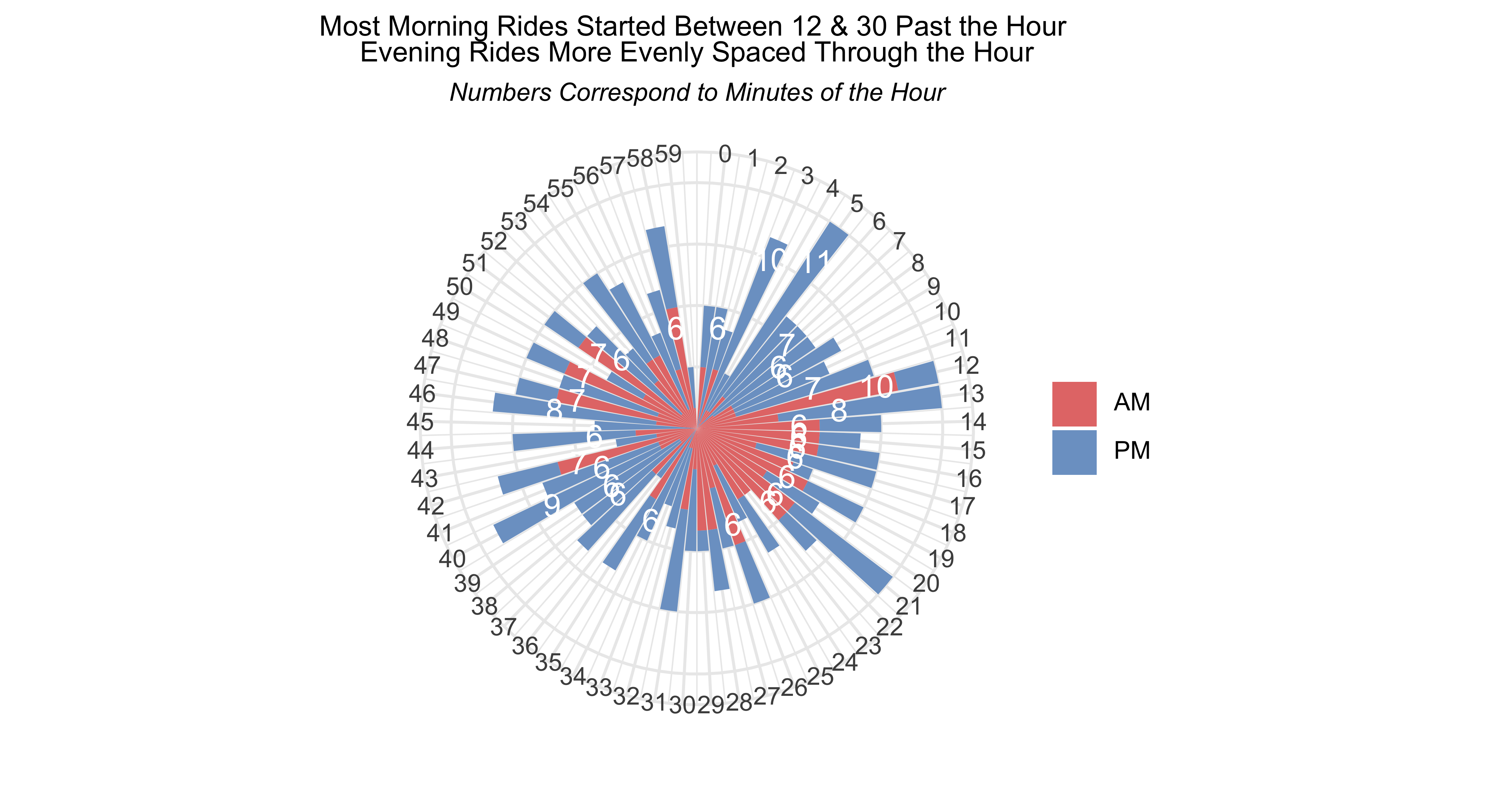
activty_ampm %>%ggplot(aes(activity_min, y = activity_min_n, fill = ampm)) +geom_col(position =position_stack(reverse =TRUE)) +scale_x_continuous(limits =c(-1, 60), breaks =seq(0, 59), labels =seq(0, 59)) +geom_text(data =subset(activty_ampm, activity_min_n >5),aes(label= activity_min_n), color ="white", size =4, position =position_nudge(y =-1)) +coord_polar(start =0) +theme_minimal() +scale_fill_manual(values =c("#E57A77", "#7CA1CC"),labels =c("AM", "PM")) +labs(x ="", y ="",title ="Most Morning Rides Started Between 12 & 30 Past the Hour <br> Evening Rides More Evenly Spaced Through the Hour",subtitle ="*Numbers Correspond to Minutes of the Hour*") +theme(legend.text =element_markdown(),axis.text.y =element_blank(),legend.title =element_blank(),plot.title =element_markdown(size =10, hjust =0.5),plot.subtitle =element_markdown(hjust =0.5, size =9))
They aren’t perfect but they’re close enough and visualised what I wanted them to show…what time of the day did I start my bike rides in 2023. For more detail and context, read the bike rides post.
created and posted April 29, 2024
Prompt #9 - Major/Minor
Please note that in November 2024 Spotify deactivated many API end points, including the ones I demo in this post and in the Spotify post from February 2021. They are still dead as of late March 2025, and I have no idea when or if they will reactivate the API end points.
The very first thing that came to mind for this plot prompt was to look at differences in music between major and minor keys. That provided me with the perfect excuse to use the spotifyr package again, as I did in my post analyzing the music from my band Gosta Berling.
As I already had the code I needed to authorize API access through the package, I figued it would be easy, and this would be at most a couple of hours of work.
Not so much.
Sparing the detail, let’s leave it by noting in order to get access to the playlist endpoint I had to redo the access code and that took a while. Then I had to figure out a way to overcome the rate limit for getting audio features. That took some time. But it’s all done, so let’s get some data and build some charts.
In my other Spotify-based post I addressed the ethical issues with using the platform, so I won’t rehash here except to say it’s a great tool for listening to and discovering music, but please, actually buy music from the artists you like or discover on the platform, especially independent artists.
Anyway, Spotify grants access to the API and gives you an id and secret code. The code below shows how to store and access the credentials.
Show code for getting playlist data - pt1
library(tidyverse)library(tidylog) # to get a log of what's happening to the datalibrary(janitor) # tools for data cleaninglibrary(spotifyr) # functions to access spotify API# if you need to add spotify API keys# usethis::edit_r_environ()# as SPOTIFY_CLIENT_ID = 'xxxxxxxxxxxxxxxxxxxxx'# as SPOTIFY_CLIENT_SECRET = 'xxxxxxxxxxxxxxxxxxxxx'# identify the scopes, or end-points, that you want.# read the spotify api documentation to decide on scopes# for playlists we need thesescopes =c("user-library-read","user-read-recently-played","playlist-read-private","playlist-read-collaborative","user-read-private")# uses the scopes and credentials to authorise the session.auth <- spotifyr::get_spotify_authorization_code(Sys.getenv("SPOTIFY_CLIENT_ID"),Sys.getenv("SPOTIFY_CLIENT_SECRET"), scopes)# pulls a list of your playlists..default is 20, you can get up to 50playlists <- spotifyr::get_user_playlists('dannebrog13', limit =20,offset =0, authorization = auth)# alternately, go to spotify and get the link to the playlist (click on the ... and select share)# https://open.spotify.com/playlist/6mlrhYRlFv3Ji5xwzqFWwQ?si=966ddb877c414599# The playlist code you need is after "playlist/" and goes up to the ?# set the playlist code as an objectlikeddid <-"6mlrhYRlFv3Ji5xwzqFWwQ"
Ok, we have the info we need to get the list of songs in the playlist. To do that I amended code I found in this post, and changed the function options for the get_playlist_tracks call.
I would recommend saving successful pulls as local rds files. You run the risk of hitting your rate limit if you call the API too many times.
Now that we have a list of songs, we want to get the audio features. These are measures that Spotify has attached to tracks to indicate things like “danceability”, “energy”, “valence” (essentially happiness) & other items. Read the Spotify developers’ guide for more detail.
Getting the audio features for a long list like this one, 1900+ entries, poses a challenge when the rate limit per call is 100 tracks. I was trying to figure out a way to loop over chunks of 100 with Sys.sleep() call but couldn’t get it to work. Luckily, someone figured out the solution to get around the rate limit that takes hardly any time. I won’t copy the code here, you can find it on the package’s repo on the issues tab.
What I’ll show below is the code to merge the track details with the audio features into a nice tidy dataframe. Read the comments in the code to see the process.
Show code for getting playlist data - pt3
# initial version of df. contains a couple of nested lists that need unpacking. easier to do in stages.liked_songs1 <- liked_track_features %>%# assign key number values to character values.mutate(key_name =case_when(key ==0~"C", key ==1~"C#/Db", key ==2~"D", key ==3~"D#/Eb", key ==4~"E", key ==5~"F", key ==6~"F#/Gb", key ==7~"G", key ==8~"G#/Ab", key ==9~"A", key ==10~"A#/Bb", key ==11~"B")) %>%mutate(mode_name =case_when(mode ==0~"Minor", mode ==1~"Major")) %>%mutate(key_mode =paste(key_name, mode_name, sep =" ")) %>%select(track.id = id, key_name:key_mode, time_signature, tempo, duration_ms, danceability, energy, loudness, speechiness:valence, key, mode, type, uri, track_href, analysis_url) %>%# join to playlist track informationleft_join(all_liked_tracks) %>%#remove a few variables we won't needselect(-video_thumbnail.url, -track.episode, -added_by.href:-added_by.external_urls.spotify) # unnest some columnsliked_songs <-unnest_wider(liked_songs1, track.artists, names_sep ="_") %>%select(-track.artists_external_urls.spotify, -track.artists_uri, -track.artists_type, -track.artists_href) %>%mutate(track.artist_names =map_chr(track.artists_name, toString)) %>%separate(track.artist_names, paste0('track.artist', c(1:6)), sep =',', remove = F) %>%mutate(across(56:60, str_trim)) %>%select(track.id:track.artists_id, track.artist_names:track.artist6, everything(), -track.artists_name)## At this point, save the file as an rds!!
BTW, the playlist in question is my “liked songs”, those I starred or hearted or whatever. To make it a list I could access via API I had to copy from the static list Spotify makes (but isn’t in the API) into a user list. You can find it here. There is of course some selection bias in the list…is the track on Spotify, have I either come across it & liked it or remembered to because I wanted a list like this for comfort listening…etc. It’s not perfectly representative of the music I like the most, but close enough.
My most liked songs are from artists like R.E.M., The National, The Hold Steady, Superchunk, Replacements, Paul Kelly, The Feelies, Teenage Fanclub, Yo La Tengo, Robyn Hitchcock…so you get the idea of sounds for when we look at the plots of audio features.
Now it’s time to make a chart. I decided to visualise the differences in audio feature values between major and minor key songs. So first I created a dataframe with all the summary stats.
Show code for getting visualisation data ready
liked_songs_summary <-liked_songs %>%rename(duration.ms = duration_ms) %>%# change loudness to abs value for better scaling in plotsmutate(loudness =abs(loudness)) %>%group_by(mode_name) %>%summarise_at(vars(tempo:valence),list(mean = mean,q25 =~quantile(., 0.25),med = median,q75 =~quantile(., 0.75),min = min, max = max)) %>%pivot_longer(-mode_name,names_to ="var_measure",values_to ="value") %>%separate_wider_delim(var_measure, "_", names =c("var", "measure")) %>%#mutate(value = round(value, 2)) %>%# change duration to seconds for easier explanationmutate(value =ifelse(var =="duration.ms", value /1000, value)) %>%mutate(value =round(value, 2)) %>%mutate(var =ifelse(var =="duration.ms", "duration_sec", var))
Now to make charts. I decided on lollipop charts to show the min and max values at either end, and the mean value along the lollipop stem. I thought I’d be able to write the basic chart as a function or put them all in one faceted cahart, but the audio features have different scales. Most are 0-1, but tempo (beats per minute) gets up to the 200s, loudness (in decibels) goes -60-0.
Then I tried to make a function for the axis scale to respond to the audio feature, but it wasn’t working so in the end it was easier to copy and amend the code as needed for the features. First up, we do all the 0-1 scale features as a faceted plot.
Click on the chart to enlarge it.
Show code for audio features plot 1
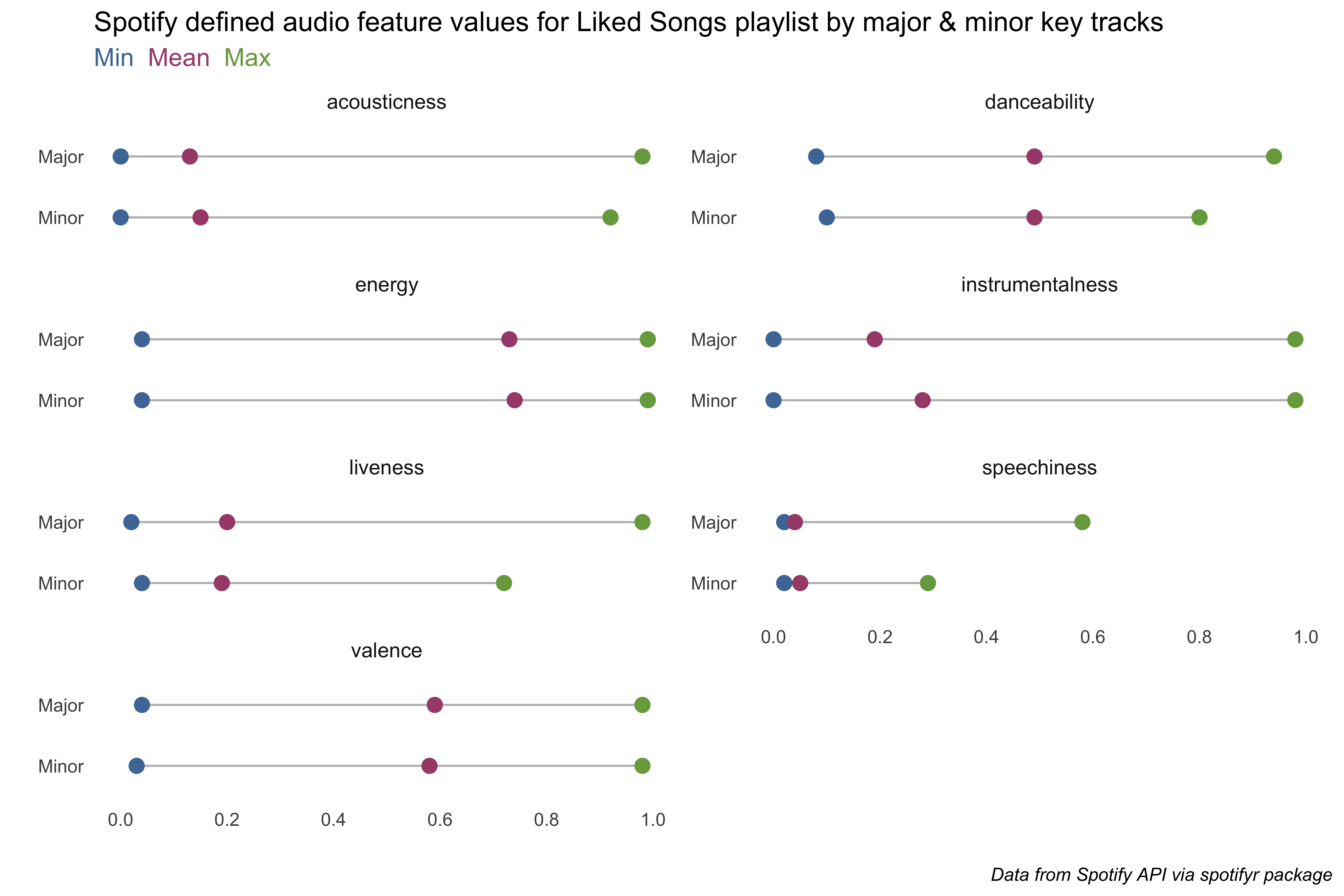
library(ggtext) # enhancements for text in ggplotliked_songs_summary %>%filter(var %in%c("acousticness", "danceability", "energy", "instrumentalness","liveness", "speechiness", "valence")) %>%pivot_wider(names_from = measure, values_from = value) %>%ggplot() +geom_segment(aes(x= min, xend=max, y=fct_rev(mode_name), yend=fct_rev(mode_name)), color="grey") +geom_point( aes(x=min, y=mode_name), color="#4E79A7", size=3 ) +geom_point( aes(x=max, y=mode_name), color="#79A74E", size=3 ) +geom_point( aes(x=mean, y=mode_name), color="#A74E79", size=3 ) +scale_x_continuous(limits =c(0, 1), breaks = scales::pretty_breaks(4)) +labs(x ="", y ="", title ="Spotify defined audio feature values for Liked Songs playlist by major & minor key tracks",subtitle ="<span style='color: #4E79A7;'>Min</span> \n<span style='color: #A74E79;'>Mean</span> \n<span style='color: #79A74E;'>Max</span>",caption ="*Data from Spotify API via spotifyr package*") +theme_minimal() +theme(panel.grid =element_blank(),plot.subtitle =element_markdown(size =12),plot.caption =element_markdown(),strip.text.x =element_text(size =10 )) +facet_wrap(~ var, ncol =2, scales ="free_y")
There’s not a ton of difference between major and minor key songs, only for liveness, which tries to measure the presence of an audience, and speechiness, or is the singing more talky or not. I was a bit surprised that valence (Spotify’s happiness measure) was the same for both.
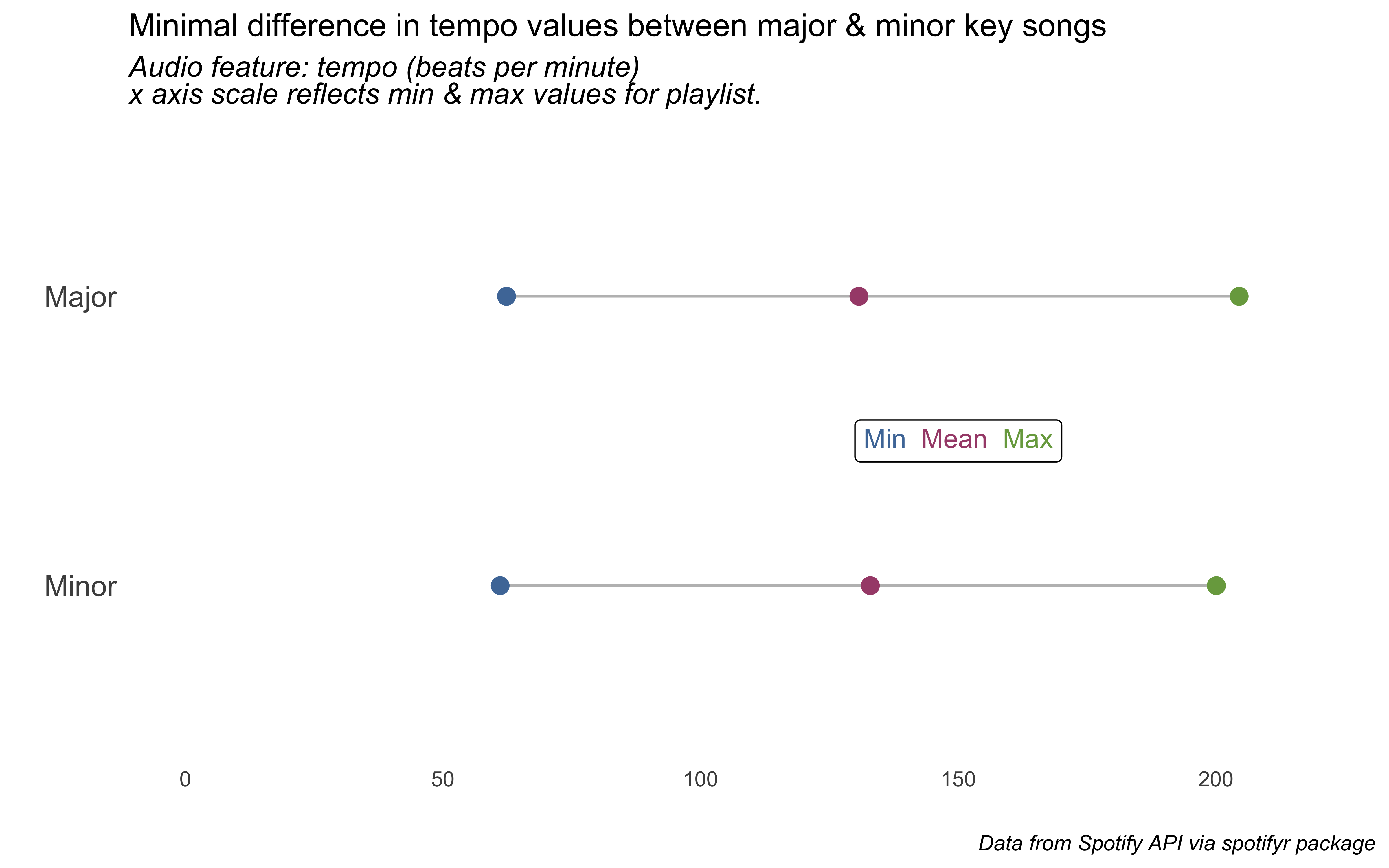
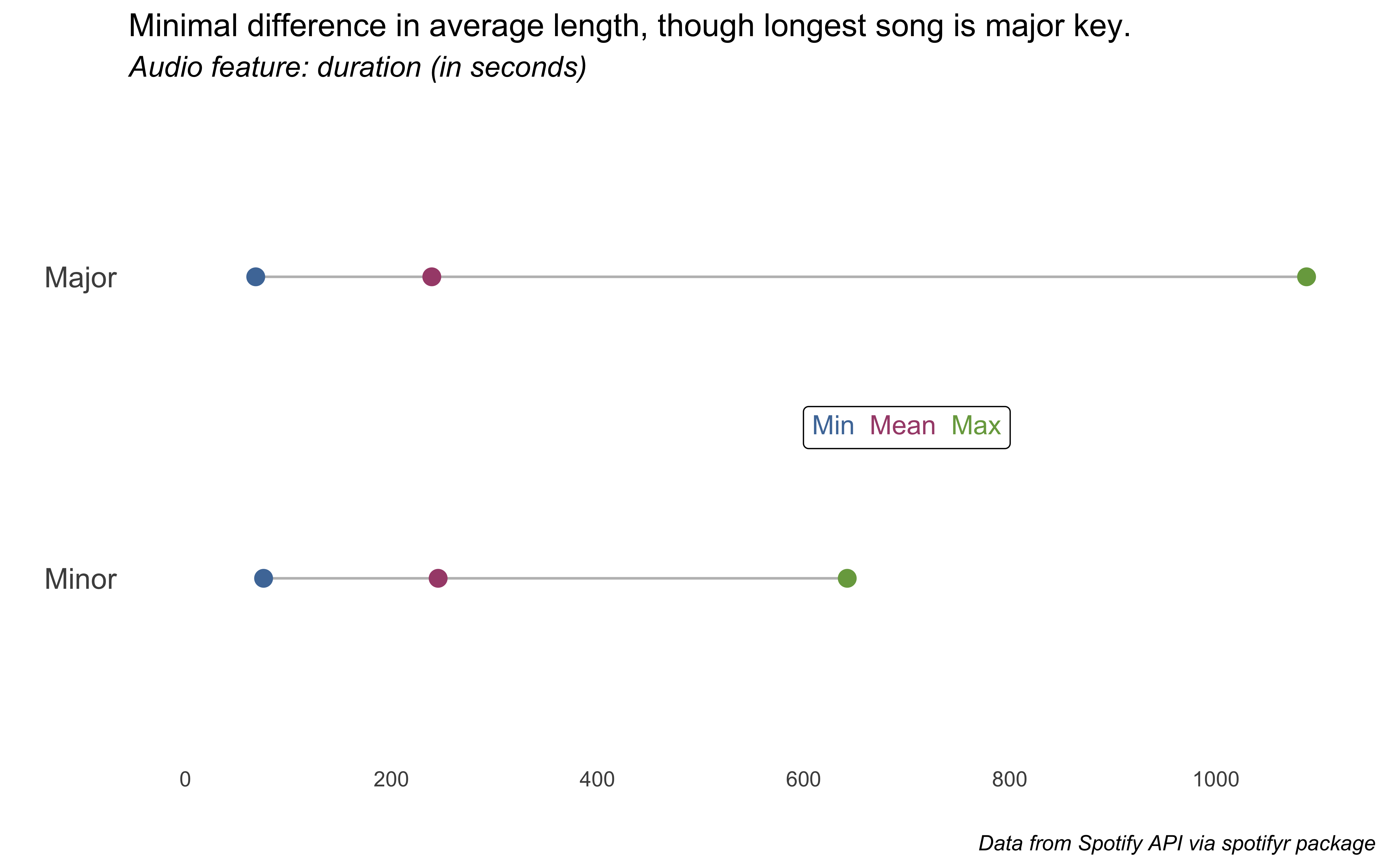
Let’s now do tempo (beats per minute), duration (in seconds), and loudness (in decibels, “the quality of a sound that is the primary psychological correlate of physical strength [amplitude]”).
Show code for audio features plot2-4
# var == "tempo" ~ c(60, 210),liked_songs_summary %>%filter(var =="tempo") %>%select(-var) %>%pivot_wider(names_from = measure, values_from = value) %>%ggplot() +geom_segment(aes(x= min, xend=max, y=fct_rev(mode_name), yend=fct_rev(mode_name)), color="grey") +geom_point( aes(x=min, y=mode_name), color="#4E79A7", size=3 ) +geom_point( aes(x=max, y=mode_name), color="#79A74E", size=3 ) +geom_point( aes(x=mean, y=mode_name), color="#A74E79", size=3 ) +scale_x_continuous(limits =c(0, 220), breaks = scales::pretty_breaks(4)) +labs(x ="", y ="", title ="Minimal difference in tempo values between major & minor key songs",subtitle ="*Audio feature: tempo (beats per minute) <br> x axis scale reflects min & max values for playlist.*",caption ="*Data from Spotify API via spotifyr package*") +annotate(geom ="richtext",label ="<span style='color: #4E79A7;'>Min</span> \n<span style='color: #A74E79;'>Mean</span> \n<span style='color: #79A74E;'>Max</span>",x =150, y =1.5) +theme_minimal() +theme(panel.grid =element_blank(),plot.subtitle =element_markdown(size =12),plot.caption =element_markdown(),axis.text.y =element_text(size =12))
Show code for audio features plot2-4
# var == "duration" ~ c(60, 1100))#duration <-liked_songs_summary %>%filter(var =="duration_sec") %>%select(-var) %>%pivot_wider(names_from = measure, values_from = value) %>%ggplot() +geom_segment(aes(x= min, xend=max, y=fct_rev(mode_name), yend=fct_rev(mode_name)), color="grey") +geom_point( aes(x=min, y=mode_name), color="#4E79A7", size=3 ) +geom_point( aes(x=max, y=mode_name), color="#79A74E", size=3 ) +geom_point( aes(x=mean, y=mode_name), color="#A74E79", size=3 ) +scale_x_continuous(limits =c(0, 1100), breaks = scales::pretty_breaks(5)) +labs(x ="", y ="", title ="Minimal difference in average length, though longest song is major key.",subtitle ="*Audio feature: duration (in seconds)*",caption ="*Data from Spotify API via spotifyr package*") +annotate(geom ="richtext",label ="<span style='color: #4E79A7;'>Min</span> \n<span style='color: #A74E79;'>Mean</span> \n<span style='color: #79A74E;'>Max</span>",x =700, y =1.5) +theme_minimal() +theme(panel.grid =element_blank(),plot.subtitle =element_markdown(size =12),plot.caption =element_markdown(),axis.text.y =element_text(size =12))
Show code for audio features plot2-4
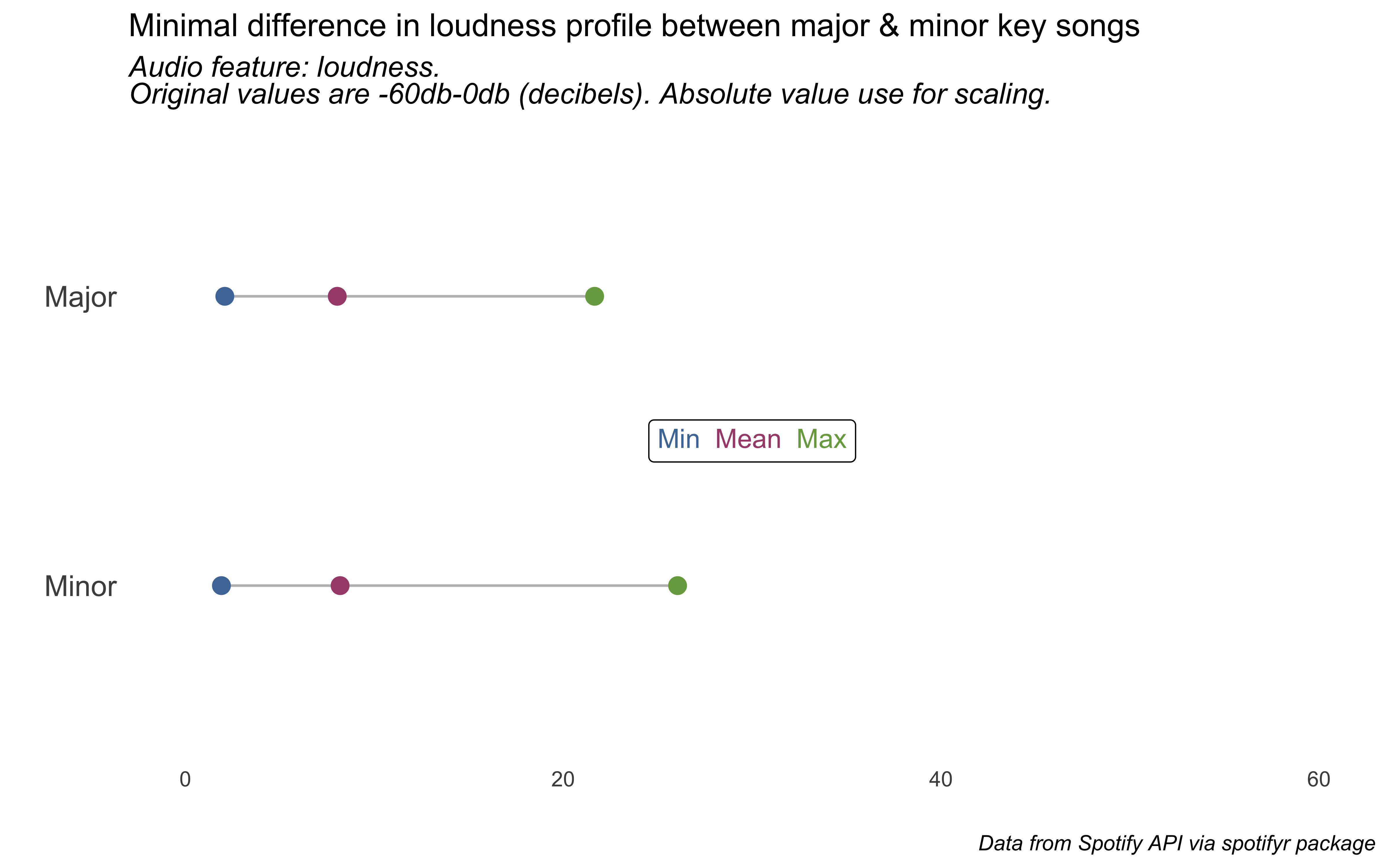
# var == "loudness" ~ c(0, 30),#loud <-liked_songs_summary %>%filter(var =="loudness") %>%select(-var) %>%pivot_wider(names_from = measure, values_from = value) %>%ggplot() +geom_segment(aes(x= min, xend=max, y=fct_rev(mode_name), yend=fct_rev(mode_name)), color="grey") +geom_point( aes(x=min, y=mode_name), color="#4E79A7", size=3 ) +geom_point( aes(x=max, y=mode_name), color="#79A74E", size=3 ) +geom_point( aes(x=mean, y=mode_name), color="#A74E79", size=3 ) +scale_x_continuous(limits =c(0, 60)) +labs(x ="", y ="", title ="Minimal difference in loudness profile between major & minor key songs",subtitle ="*Audio feature: loudness. <br>Original values are -60db-0db (decibels). Absolute value use for scaling.*",caption ="*Data from Spotify API via spotifyr package*") +annotate(geom ="richtext",label ="<span style='color: #4E79A7;'>Min</span> \n<span style='color: #A74E79;'>Mean</span> \n<span style='color: #79A74E;'>Max</span>",x =30, y =1.5) +theme_minimal() +theme(panel.grid =element_blank(),plot.subtitle =element_markdown(size =12),plot.caption =element_markdown(),axis.text.y =element_text(size =12))
So there you have it. An approach to visualising audio features. There’s more to do here, but that will have to wait for an even more in-depth post. This turned out to be longer than I planned.
p.s. - yes, I know I’m now posting these after the chart challenge is officially over. but they are good exercises for me to keep learning and creating. and i’m enjoying it, so…